How to Make an Artist Portfolio That Gets Noticed
Learn how to make an artist portfolio that wins reviews. Practical steps for selection, presentation, hosting, and sharing—written for creators, not coders.

You've got the work, but the portfolio still feels slippery. One version looks too broad, another feels too bare, and every time you add a piece you worry you're weakening the whole thing. That's the core problem most artists run into, not a lack of talent, but a lack of structure.
A strong artist portfolio isn't a dump of everything you've made. It's a set of choices that tells the right viewer, fast, what you can do, what you care about, and why they should keep looking. Build it that way, and the same body of work can serve schools, galleries, and clients without turning generic.
Start With the Audience You Actually Want
The first mistake is sending a portfolio to “everyone.” That's how artists end up with a folder that feels polite, vague, and easy to forget. A gallery, a school, and a client are not reading for the same reason, so the same sequence won't hit the same way.
Write the one-sentence audience answer
Before you move a single file, write one sentence: This portfolio is for ___, and it needs to prove ___. If you can't fill those blanks, the selection will drift. A graduate program wants evidence of direction and investigation, a brand client wants proof you can solve a visual problem, and a gallery wants a coherent point of view.
Practical rule: if a piece doesn't help that specific viewer say “yes” faster, it doesn't belong in the cut you're sending.
Keep one evidence library behind the scenes, a single place with master images, process shots, captions, project notes, and short bios. From there, you build cuts for different audiences instead of rebuilding everything from scratch. That keeps the work coherent while still letting each version speak the right language.
For a school review, lead with work that shows curiosity, growth, and a clear hand. For a commission pitch, open with finished pieces that make the outcome obvious. For a gallery, start with the piece that says who you are without needing a speech.
Edit Your Selection Down to Your Strongest Pieces
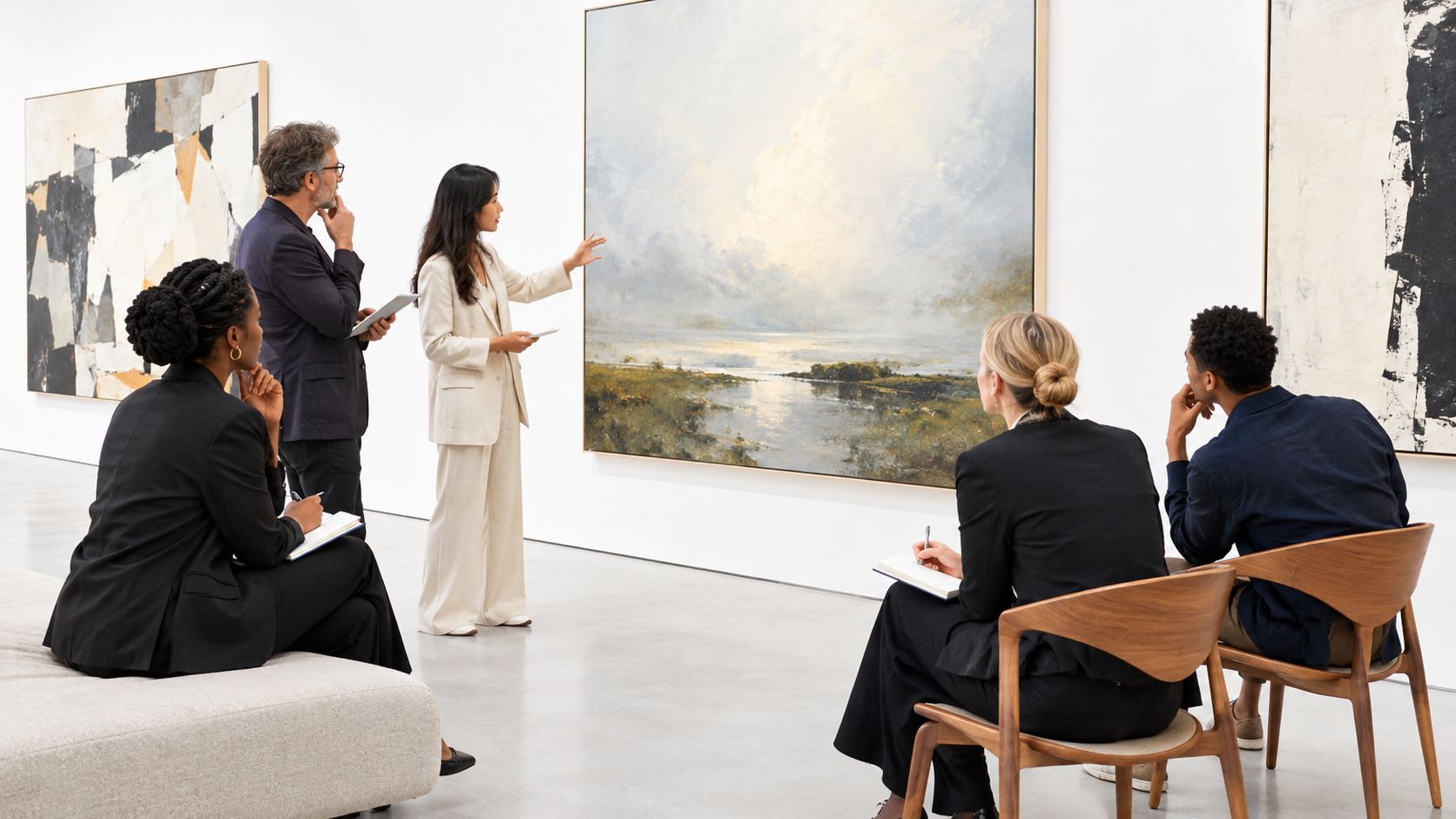
Selection shows your judgment. The folder you avoid opening, the one with forty files, mixed quality, and no order, is a selection problem.
Run every piece through four questions
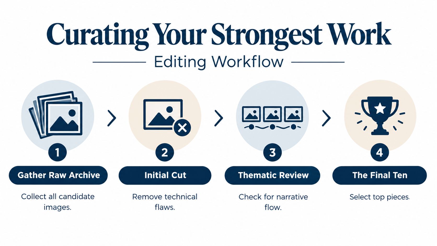
Start with the roughest folder you have, then sort everything into three piles, in, maybe, and out. Put every piece through four blunt questions. Is it one of your strongest works? Does it show the work you make now? Is it documented well enough to judge? Would you show it publicly without making excuses?
A finished painting with strong composition and clean documentation usually earns a place. A sketchbook page can still be good work, but it may belong in process material instead of the main cut. A client commission may fit if it matches the audience, yet it should come out if it no longer reflects the direction you want more of.
If a piece stays only because you like it, cut it. Keep work that helps the viewer understand your practice fast.
Build the sequence like a set, not a folder
Once the weak work is gone, group what remains by project, material, or idea. Keep the sequence tight. Around 15–20 resolved works is enough if your body of work supports that number, and fewer makes more sense for stricter applications. Open with an image that reads at a glance. Put related work in the middle. End on another strong image so the finish holds.
Captions should do their job and stop. Use title, year, medium, dimensions, plus a short note if the concept or process needs it. That gives the viewer what they need without turning each page into a studio diary.
Use process work with intent
Sketches, failed experiments, and revisions matter when they show development. They do not earn a place just by existing. A process page should explain the problem you were solving, not smother the image with commentary. Keep the strongest project at the front, the clearest resolution at the end, and let the middle show range without making the whole portfolio feel scattered.
Tailor One Library Into Several Targeted Versions
Artists waste time when they think the choice is either specialize or show range. It isn't. The smarter move is to keep one strong library and cut it differently for each audience.
Keep the master, change the cut
Your general portfolio should show the clearest version of your practice. From that, make narrower cuts. A school version leans harder on process, experiments, and development. A client version puts outcomes first. A gallery version needs a sharper editorial line and less explanation.
The same body of work can do all three jobs if you change the order and the support material. A project that feels too quiet for a client deck may become the center of a residency cut if the process behind it is strong. A highly finished commercial piece may be perfect for outreach, but it may not help an admissions reviewer understand how you think.
| Audience | Ideal length | What to lead with | Caption style |
|---|---|---|---|
| Gallery | Tight and selective | A clear signature project | Brief, confident, low explanation |
| School | Focused but varied | Process, investigation, and growth | Short context that explains intent |
| Client | Outcome-driven | Finished work closest to the brief | Practical notes about role and result |
| Residency or grant | Concept-forward | Projects with visible development | Process and rationale that show depth |
Swap the order, not the identity
Don't build separate identities for each audience. That's how portfolios start contradicting each other. Keep the same voice, the same visual standards, and the same evidence library. Change the opening piece, the emphasis on process, and the amount of context you give.
For a commission pitch, lead with the strongest finished piece and a couple of close relatives. For a school application, move the experimental work up and show the thinking behind it. For a gallery inquiry, strip away clutter and let the sequence feel intentional from the first screen.
Good versioning is editorial, not cosmetic. You're not making a fake portfolio for each room. You're choosing which parts of the truth matter most to that room.
Prepare Images and Documents So the Work Reads Right
Beautiful work can still look amateur if the files are sloppy. Bad lighting, weak crops, muddy color, and bad file names will sink a portfolio faster than people like to admit.
Get the images under control
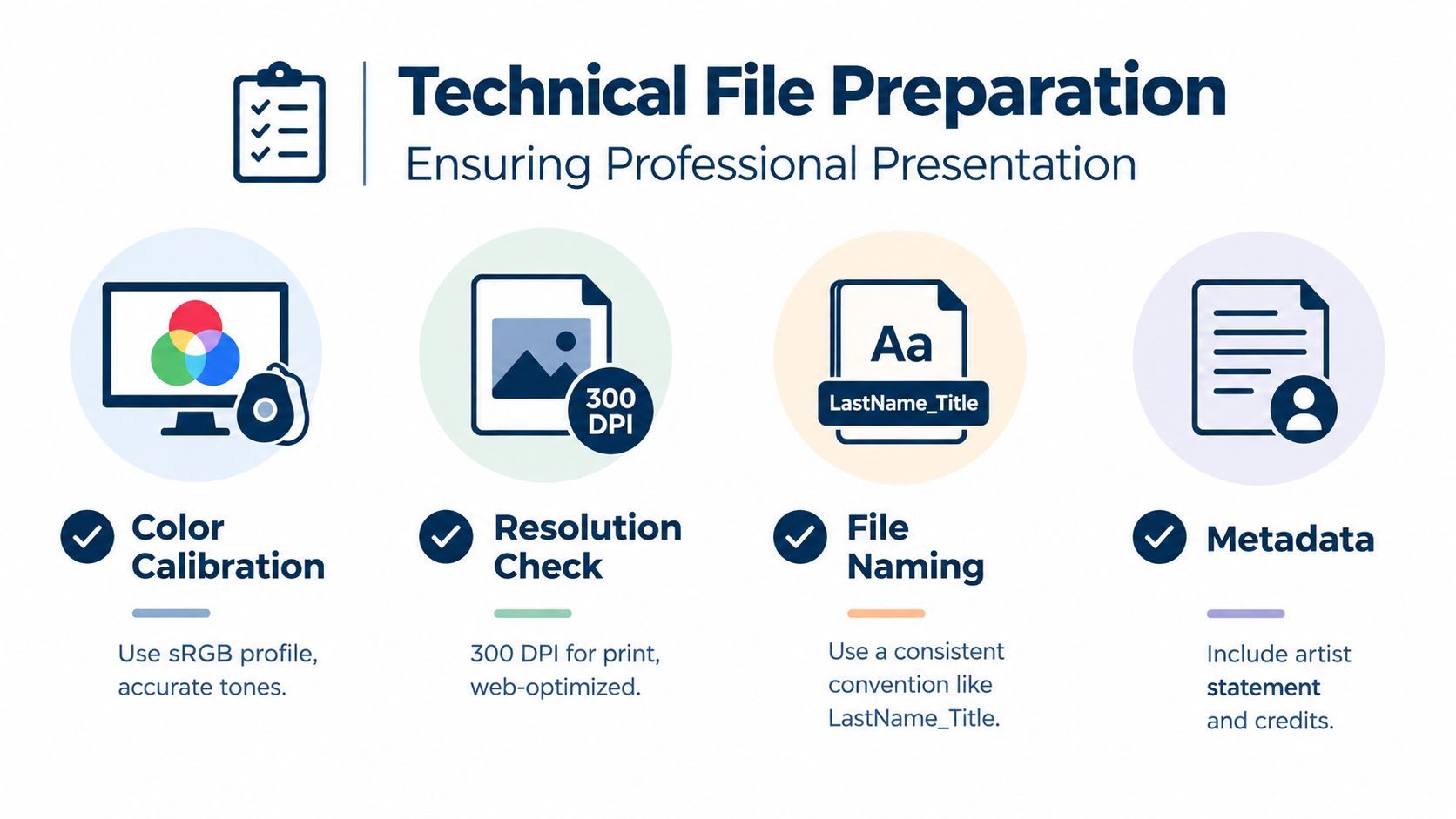
Photograph or scan work with controlled, even lighting, accurate color, and consistent cropping. For flat work, shoot straight on and keep the background clean. For sculpture or installation, show more than one angle so the viewer can understand the scale and form. If the piece is too large, too reflective, or too tricky to document well, hire the documentation out instead of guessing.
Name files in a simple, consistent way so you're not hunting through nonsense later. LastName_Title is enough to keep things organized. Keep a high-resolution master for archive purposes, then export web-ready versions that load quickly and still look sharp.
Make every page readable without the image
Alt text should describe the work plainly, not stuff it with keywords. Captions should explain what matters about the piece, not repeat what the viewer can already see. If the work includes video or audio, add transcripts. If it's research-heavy or text-based, offer a downloadable PDF that opens cleanly and reads well on its own.
For a practical file-sharing route, you can also publish PDFs and image sets through Upfling, which turns uploaded files into live links without forcing you into a build process.
Test the basics like a human being
Open the portfolio on a phone, not just a laptop. Check that the text is readable, the buttons are obvious, and the layout doesn't break when the screen gets smaller. Try moving through it with the keyboard, and make sure the site still makes sense if images load slowly.
Get It Online Without Learning to Code
A portfolio that sits in a folder helps no one. Put it online, keep the link stable, and make sure you can swap work without rebuilding the whole thing.
Pick the path that matches your tolerance for friction
A builder works if you want visual control and do not mind spending time in settings. A custom site works if someone technical is helping you. For artists who want a cleaner setup, drag-and-drop static hosting removes the parts that slow you down, like deployment steps and build settings, while keeping the basics in place.
You upload a folder, ZIP, HTML file, PDF, or image set, then get a live URL. The platform can detect the entry page automatically, add SSL, and keep the address stable when you replace files later. That matters once the link has already gone to a gallery, client, or admissions reviewer.
Use the features that make sharing easier
A good portfolio host should give you a custom domain if you want one, password protection for review copies, analytics you can read, and QR codes for in-person sharing. These are working tools: a custom domain for credibility, password protection for review copies, analytics you can read, and a QR code for in-person handoffs. If you hand someone a card at a show or a printed leave-behind after a meeting, a QR code cuts out the awkward typing.
The simplest workflow is this, drop the folder, check the preview, publish, then share the URL or QR code. If you need a private version for one reviewer and a public version for everyone else, keep both live and separate. That is cleaner than emailing giant attachments or juggling broken file links.
For a straightforward way to host a folder or image portfolio without the usual deployment hassle, Upfling lets you publish static files as shareable pages and keep the URL stable when you update the contents.
Know what this approach won't do
Static hosting will not handle a complex interactive app or a large ecommerce build. It does fit a portfolio that loads fast, stays up, and does not force you into part-time developer mode. If your goal is a portfolio that loads fast, stays up, and does not turn you into a part-time developer, the trade is worth it.
Share It, Track What Happens, and Keep It Fresh
A portfolio sitting on your desktop doesn't help you. The whole point is to put it in front of people who can hire you, admit you, represent you, or at least tell you what landed.
Treat sharing like part of the portfolio
Use one stable public URL for general discovery, then create a password-protected review link when you want a cleaner, controlled version for a client or admissions panel. Put the URL in your email signature, studio materials, and business card. If you do in-person reviews, a QR code makes the handoff easier and less awkward.
The smartest analytics are the ones you can read. You want to know which pages are visited, what devices people use, where they came from, and whether they clicked contact. That's enough to spot patterns without turning the portfolio into a surveillance project.
Practical rule: watch for what gets opened, not for vanity numbers. If people keep leaving after the first piece, the problem is usually the opening, not the whole site.
Keep a maintenance rhythm
Set a quarterly checkup and treat it like studio cleanup. Replace weak work, refresh captions, test links, retest accessibility, and look at the site on a phone again. If a project no longer represents the level you're working at now, remove it.
A stale portfolio hurts credibility. A current one tells people you're active, selective, and paying attention. That's the impression you want.
For a simple way to publish, share, and update portfolio files without wrestling the back end, Upfling is built for static pages, PDFs, images, and folders that need a live link fast.
If you want a portfolio that feels clear instead of cluttered, build the evidence library first, then cut it for the audience in front of you. Upfling gives artists a plain way to put those files online as live, shareable pages without wrestling with deployment. Visit Upfling and use it to turn a finished folder into a portfolio you can send.